NSF Awards: 1350282
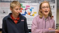
Technological advances are changing the way we collect, view, and interact with data. As a result, data visualizations move far beyond conventional graphs, tables, or diagrams to use problem-specific imagery and computational techniques to reveal patterns of interest. The DataSketch project explores the hypothesis that by exploring and constructing their own novel, interactive data visualizations, students can develop data literacy, learn important core STEM content, and engage in key STEM practices in powerful new ways.
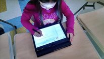
The DataSketch project involves (1) research on grade 6-8 students’ knowledge and development related to data visualization, and (2) continued development and study of DataSketch, a tablet-based tool for students to create sketches and program them to respond to archival or live data input to become interactive visualizations. Our goals are to develop a model of students’ data visualization competencies, and encourage the development of those competencies in the context of their existing mathematics and science curriculum.


Brian Drayton
Well, this is pretty exciting. I have seen quite a few great interactive data analysis systems, but I love the sense of freedom-in-design that this conveys. I am curious about the relationship between the data being used and students’ choices about what variables or other qualities to represent. For example, where did the categories of meteorological phenomena come from in the precipitation/wind direction example? I am assuming also that the system allows the students to work with tabular data and traditional graphs? This would make for an interesting comparative study about how the various modes of representation relate (in the students’ minds)..
Thanks!
Michelle Wilkerson
Assistant Professor
Thanks for your questions! Looking at the nature/structure of data sets and how students choose to represent them is a major thrust of the research component of the project (motivating, in fact, how the technology was developed). In an early pilot, we found that students were likely to use more conventionally sophisticated representational forms – things like abstract symbols, timelines, continuous interval axes, or existing forms like line graphs when dealing with multidimensional, interrelated changing quantities (population birth and death rates affected by multiple outside factors) or statistically distributed, covarying quantities (a collection of plants growing together over the summer) than with simple quantities such as changes in speed of velocity of a single object. A few students (about 20%) even spontaneously developed representational rules to manage the dimensional complexity of the plant situation. While they didn’t always come up with perfect representations spontaneously, this was exciting because it suggested that (1) kids are able to work with complex data sets, (2) certain data structures elicited certain kinds of representational competencies that we could then build on through instruction, and (3) contrary to what some people might think, simplifying the problem isn’t always the answer when kids are struggling to represent data. One interesting thing we found was that while some students used the same representational mode for all three situations (simple, complex, and statistically distributed data), this was quite rare – they often employed very different strategies and techniques depending on the data type. These results have not yet been published in a journal but have been presented at conference and I’m happy to share a draft of the manuscript with anyone interested.
Traditional graphs are not included as a special function, but we are very interested in how students might approach creating traditional graphs using the tool and this will be part of our upcoming set of interview studies. Currently, students can view with the data in tabular form, and we intend to allow them to enter and manipulate the tabular data in the next iteration of the software.
Pati Ruiz
Dean of Studies
Teaching students about data visualization literacy and supporting their own data representations is a great approach! How are you working with teachers to help them create appropriate lessons? How are you training teachers and students to use the tool? What is the learning curve (for the tool) like? How is the introduction to the tool scaffolded?
Also, this seems like a great tool to do what you say in the last line of the video – explore what they care about – how will you support learners’ use of your tool outside of the classroom?
Michelle Wilkerson
Assistant Professor
Hi Pati! Great questions. We are involving teachers in a few ways. One, some of the preliminary studies that inspired the current project (without the software) were in close collaboration with a teacher who was already enacting data visualization curriculum herself in her class. Two, the project includes an intensive teacher consultation summer session during which we will trial the software and do codesign activities with teachers to develop NGSS aligned curricular units. We are still working on user studies, so I can’t speak to the learning curve yet but we are working hard to make sure students can start creating visualizations on day 1. There is definitely some more interface work to be done, especially around calibrating the objects so they are scaled to the data in meaningful and transparent ways.
During the later years of the project, we also intend to leave a more stable version of the tool in informal learning spaces – schools with maker spaces, or for use with after school and outreach activities. So I can’t speak to that yet, but it is in the pipeline and I agree is something that is worth exploring!
Pati Ruiz
Dean of Studies
Thank you for this additional information!
Jenna Marks
Doctoral Student in Cognitive Studies in Education
This is insanely cool and something I could see myself using for my own data! Have you thought about the potential to bring this to high school, college, etc? I wonder if by creating novel visualizations, more advanced scholars would better be able to understand their own datasets.
What does the co-curriclar piece look like for this project? Do students used worked examples or build step-by-step visualizations with a teacher to get started?
Michelle Wilkerson
Assistant Professor
Hi Jenna! I agree about more advanced scholars, while our research focus currently is on middle school we of course would be interested in seeing a longer trajectory of development and competence. I know that Bret Victor and others have been thinking about building tools in which data drive user-generated visualizations that are intended for professional audiences, as well. Some of the research that we read while beginning this project and that motivates the current work, is from the HCI and data analytics communities and describes data visualization as a process of inquiry rather than as an image on the screen for exactly the reasons you point out.
We are still in the early phases of the project, so are still working with individuals and small groups of students, and have plans to work with teachers as well, as a way to inform the design of curricular units. In a series of interviews we are doing with some students with the purpose of refining our curricular designs, we will be providing students with pre-constructed (but faulty, in a variety of ways) visualizations of existing data. We’ll ask them to “edit”, or recreate, those visualizations using the tool. In other cases, we have asked students to sketch the scenarios fist, and then start thinking specifically about data representation after that. In yet other work with teachers, students interacted with existing visualizations of related data before starting on their own visualizations. Given all of these approaches, the work we are doing now is exploring more systematically though interviews and consultations with teachers which of these entries makes sense for the classroom.
Brian Drayton
I am curious about the reasons you’re focusing on middle school. I have been part of several projects where that has been the focus, and it’s partly because middle school has been more flexible than high school in trying new things, and partly because of characteristics of middle school students and the curriculum at that age. What does middle school offer you that’s of particular interest?
Brian Danielak
I was wondering whether:
1. The software is in a state that classes can start using it. (I would love to use this in my classes this fall)
2. There’s a public source code repository
Michelle Wilkerson
Assistant Professor
Hi Brian! I’m not sure on (1). What is demonstrated in the video is pretty stable. But, things like calibration are still a bit clunky and feel arbitrary to the user. Might make sense for undergrads, but we probably won’t be using it in classrooms without another iteration or two. Yes for user studies. On (2), an enthusiastic yes: https://github.com/ExTechLab/DataSketch
Avron Barr
Consultant
Fascinating project and engaging video. Thanks Michelle and Vasiliki. What have you learned about individual differences in students’ use of the tool?
Andrew Izsak
Hi Michelle,
I agree with other comments above that the tool you are developing is extremely interesting. Less to clear to me is whether and how you are investigating interactions between children’s understanding of the contexts from which the data came and the ways they develop for representing that data. I could easily imagine that chidlren “more” knowledgeable about a given context could represent data from that context in more varied and elaborated ways than children “less” knowledgeable about the same context.
Andrew
Michelle Wilkerson
Assistant Professor
Thanks for your question! I agree this is a fascinating line of attention that we could certainly focus more of our efforts on. I can talk a little anecdotally about what we have found so far, and some ways we might look for it more closely in the future. In terms of what we’ve seen so far, students definitely do develop more varied and elaborate representations of data they are ‘closer’ to. But, what ‘closeness’ to data actually means is hard to pin down. In one example, we asked children to represent changes in people’s (children and adults’) heights over time. The students did not collect the data, it was provided. Yet the problem statement itself proved very familiar to the children we’d interviewed, many that tracked their own heights by marking them on the walls at home. Because they had this shared experience, the students chose to represent the data in this way – as markings on a vertical line, annotated with dates of measurement. Similarly, in a series of interviews where students interact with existing data visualizations that depict data the students ostensibly have little personal connection to (animal populations or fuel), we find that some students nevertheless recall personal experiences that might illuminate patterns in the data, or question how the data were measures and whether they were appropriately represented. I’d suspect that different relationships with data might all shift how the students think about context: did we collect the data? Do the data remind us of personal experiences? Are the data about us, or the places we live? Do we trust the data and its conversion to a given representational form enough to make conclusions based on what a visualization shows?
I imagine that we might have more of an opportunity to explore this once the classroom studies start, and it would be especially great to be able to compare student productions generated with (1) data that are provided with little ostensible direct connection to students, (2) provided data that are from students’ immediate contexts, and (3) student-generated data. Because we are partnering with and working closely with teachers to develop curricular units, this will be something that we can integrate into our development sessions!
William Finzer
I too think this is great stuff and the video vividly conveys the connection students are making from changes in the data to changes in the sketches they are making. Now here’s what might seem like a silly question: What do you think DataSketch students might answer to “What do data look like?” and how do you think that might change during the time they work with DataSketch?
Roger Taylor
Very interesting research – I teach a graduate level data visualization seminar and would like to try this my students next time! Do you have a sense yet of a trajectory or learning progression for the students?
Further posting is closed as the showcase has ended.